 Biosphere
 Biosphere
Issues that are present in the Megabiota laboratory research process can be focused around the two core topics:
Through a combination of these two problems, the data being produced by the Madingley model is not being properly introduced to the public as intended. Therefore, these issues need to be remedied in order for the data from the revolutionary model to be fully utilized.
To see a full walk-through of the solution, please look at the Documents page or download the code given on the home page.
The general solution to this problem was to create a progressive web application that allows the target audience to visualize the results of the Madingley model. In order to guide the end-user through the application, we had a handful of features that needed to be implemented:
In order to allow the user to select some location, the application accesses the user’s GPS, has the user select an area on an interactive map object, or has the user specify the longtitude, latitude, and radius of a region. In each of these situations, the user will have selected some location of interest. This location selection will allow the application to hone in on the geographical area of interest.
The user will then be asked to choose a scenario from a predefined list of scenarios. This list includes, but is not limited to: climate change, deforestation, land use. After doing that, the user will then be prompted to select an intensity that corresponds with that selected scenario. These specific selections will allow the application to narrow down what dataset should be considered.
Given the selections of the above mentioned choices, the application will then return a small finite set of data that will be of use to the end user. The final steps remaining in the solution plan involve the user selecting what type of output they wish to view. This option will then allow the application to tailor the scenario results to a pre-specified sub audience. This specification is done to allow the user to quickly and easily view the information of interest rather than a general output.
Once the user has viewed the rendered data, the final step that the user will be interested in, involves exporting the information. This step allows the user to save the results of a scenario to be used later as they see fit, whether it be for further analysis or for presentation purposes.

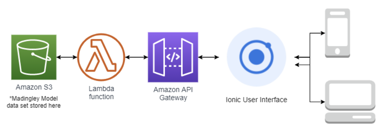
Our project has four main components: AWS S3 bucket, AWS lambda functions, AWS API Gateway, and the Ionic interface. The S3 bucket stores all of the Madingley Model data. In order to retrieve the data, our application uses several lambda functions. They fetch the data and process it. After it has been processed, the API Gateway transports the data from the lambda function to the Ionic interface. When the data reaches the Ionic interface, the user will get the output that resulted from their initial input.

Each of the components in our application’s architecture was chosen through intensive research and comparison, and was included because we felt it was truly the best candidate for its job.
The AWS API Gateway, Lambda, and S3 backend services were all chosen because Amazon has the highest regarded web services due to them being extremely easy to integrate. Not only can they be easily integrated with each other, but they can also be integrated fairly easily with a separate UI framework for a hybrid application like ours. They are also extremely reliable, and very easy to maintain especially for someone who doesn’t have a computer science background. It isn’t difficult for someone with no programming experience to learn how to use their intuitive services.
One of the main reasons we decided to use the Google Maps API was because it has been around for a long time. As a result, it comes with great set of online developers documents that helped us implement several features within our app. Lastly, it has some necessary features that it's competitors don't have. For example, we needed a reliable heatmap generator and the ability to move a circle across the map.
The Ionic UI was chosen because it allowed for a smooth Cross-platform development experience. This gave us the ability to not only share a single code base, but to also share individual written components between iOS, Android, and web application interfaces. This maximized accessibility to the application, while still providing a smooth and easy development process.
Lastly, we decided to use Chart.js because it produced the best graphs out of all the visualization software that we researched. It was also easy for us to implement because some members on our team already had experience with JavaScript.
