Touch Screen Interface
Unlike the remote assistant interface, we weren't limited by a specific hardware platform for the touch screen interface, giving us greater flexibility with our designs.
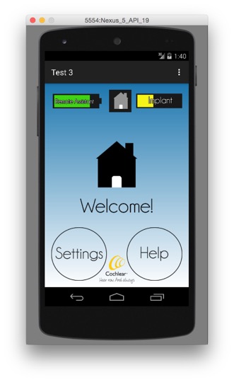
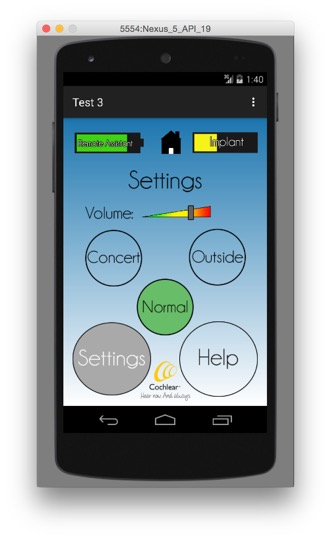
We opted to keep our design consistent with the remote assistant GUI, but with the added screen real estate, we were able to add some additional features and some upgraded visual effects.
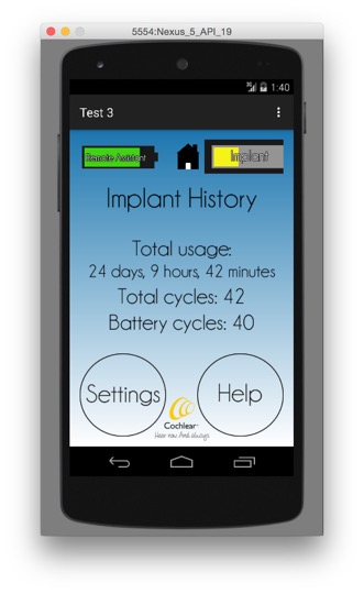
One addition to this interface is the dynamic battery icons in the upper portion of the screen. These icons both "drain" and change colors at the battery level changes. If the user presses one of these icons, they are presented with more detailed information about that particular battery.
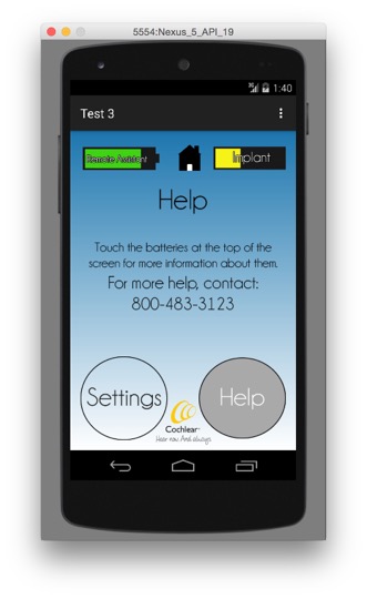
Another new aspect of this GUI compared to the remote assistant interface is the addition of a help screen. Users are able to get help in the use of the interface, as well as contact information for Cochlear's support center if they require further assistance.
Final Designs
Below are some screenshots of our final design running on an android emulator.


